Xcelsius Interactivity: Chart Drill-Down
In this post, I’ll create a simple dashboard that will allow users to interact with the components to change what data is displayed on the screen.
I will have one chart showing revenue by country, and another showing revenue by sales category; clicking one chart will apply a filter to the other, and vice versa.
You can download the finished dashboard here, and get the xlf file here.
The data I’ll use for this example looks like this:

- See more at: http://blog.davidg.com.au/2011/04/xcelsius-interactivity-chart-drill-down.html#sthash.Q5Gft76I.dpufI will have one chart showing revenue by country, and another showing revenue by sales category; clicking one chart will apply a filter to the other, and vice versa.
You can download the finished dashboard here, and get the xlf file here.
The data I’ll use for this example looks like this:

- By default, no category or country will be selected, so the first thing you’ll need to do is add a total column and row using the SUM function (you can press ALT+= and Excel will guess which cells you want to sum).
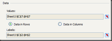
- Now add a pie chart to the canvas and bind the Labels to the country names and the Values to the total row.
- Add another chart and bind it to the category labels and values. Remember to select the Data in Columns option.
- Set a title for each of the charts, don’t worry about the sub-title for now.
Next, you will set the drill-down property of the charts to allow your users to interact with the dashboard. This how it will work: - The user will click on a slice of the pie. For example, click on the Bikes category in the revenue by category pie chart.
- The chart will insert the row number for that category into the spreadsheet. In this case, that’s row 2.
- The total column will then change to only show the row of data for the bikes category (the row starting with $9,506,689.17)
- The second chart, showing revenue by country, will still show each of the countries, but now it will only show the values from the bikes category.
- As always, it’s a good idea to colour-code your cells. I’ll use yellow to indicate that a component will be writing a value back to the Excel sheet. Do this just below the category names.
- Add in some numbers along the top and down the left. Since the row() and column() formulas aren’t supported in Xcelsius, you’ll need these numbers to ‘look up’ the correct value.
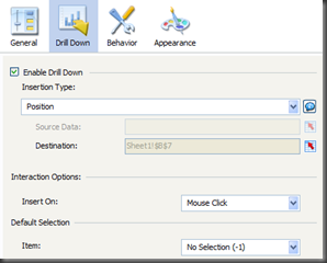
- Edit the properties of the revenue by category chart, so that it will insert the position of the pie in cell B7 when clicked. The settings should look like this:
- At the moment, row 7 will always show the total of the cells above it. We want to change that so it will show only the total if no pie slice has been selected, but otherwise, it will show only the data from the appropriate row. This is the formula in cell C7:
=IF($B$7="",SUM(C3:C6),INDEX($C$3:$H$6,$B$7,C1))
Copy that formula across so that it applies to all countries (i.e. C7:H7). - Set up the drill properties and the total formula for the country pie and category total formula. The logic is exactly the same. If you user has clicked a slice of the country pie, then only the results for that country should show in column I, otherwise, the total for the whole row should show. This is the formula in cell I3:
=IF($I$2="",SUM(C3:H3),INDEX($C$3:$H$6,A3,$I$2)) - Preview your dashboard and check that everything works as it should.
It’s Not Working!
If you click on the slice for the Bikes category, does the chart showing revenue by change? If it isn’t working for you, first make sure you have your formulas correct. Try typing a number into one of the yellow cells. Are you getting the results you expect? If the formulas look fine but the interaction still isn’t working, the problem might be in your drill-down setup. Add a Spreadsheet Table component (from the Selectors category) to the canvas. Bind the display property to all of the cells you’re working with. Now preview again. What’s happening when you click the pie?The Finishing Touches
It would be nice for your users to be able to see what’s in their pies, so next we will add a little formula to display which slice was clicked for each chart and show the results of that in the sub-title of the other chart.- Colour code the cells where your formulas will go. I like to colour code any cell with a formula in it orange.
- In cell B8, type in a formula that will show the name of the category that has been selected. If there is no category selected, you may want to leave the sub-title blank, or show all categories. The formula in B8 is:
="Category: " & IF(B7="","All",VLOOKUP(B7,A3:B6,2)) - Do the same for the countries. The formula in J2 is:
="Category: " & IF(I2="","All",HLOOKUP(I2,C1:H2,2))
Note that it’s an HLOOKUP since you’re looking in a horizontal list. - Now bind the revenue by category chart sub-title to the cell that shows the country, and the revenue by country chart sub-title to the cell that shows the category.
- Lastly, add a reset button, since the user needs to be able to return to seeing all values. Drag the Reset Button component (from the Other category) onto the canvas. When clicked, this component resets the contents of the Excel sheet to the way it was when the flash file was loaded.
- Drop a nice background in and you’re done.


No comments:
Post a Comment