Webi as a Dashboard
We all know that SAP Dashboards (formerly Xcelsius) is the king of dashboarding. But it isn't the best solution 100% of the time. In this post, I'll show you how to create a dashboard in Webi that can rival a Dashboard dashboard.
I'm Using:
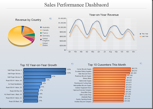
Let's start at the end…
This is a dashboard. In Webi.
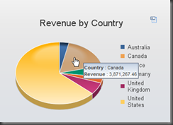
I can hover over a chart to see more details:
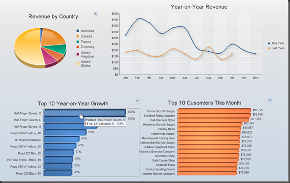
I can interact with it. For example, clicking on the product with the highest year-on-year growth filters the top two charts.
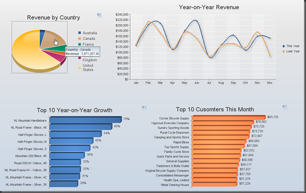
Or click a pie slice to only see results for Canada:
So… Why use Webi for a dashboard when we have the marvellous Xcelsius at our fingertips? There's a few reasons why you might choose Webi over Xcelsius:
The above dashboard was done in BI4.0 with it's fantastic new charting engine. But you will get a similar output from Webi in XI3.1, with a little less polish:
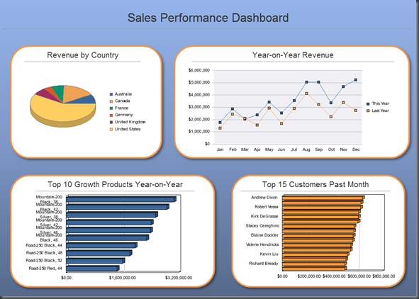
Those charts are a little blocky, no fancy shadows under the lines in the line chart, no transparent background, and no tool-tips when you hover over a chart. But the data is of course, still the same.
Let's get started.
Xcelsius is still king of the dashboard world, but if you need something that can be published, taken offline, incorporate large chunks of raw data, and be edited by users, Webi is here for you.
Happy charting!
- See more at: http://blog.davidg.com.au/2011/04/webi-as-dashboard.html#sthash.tNZ7uAiw.dpufI'm Using:
- BI Platform 4.0 (but read on if you're using XI3.1)
- Launch pad/Webi
- Microsoft PowerPoint (any simple drawing tool will do)
I'm Assuming:
- That you're familiar with Webi, particularly working with charts.
Let's start at the end…
This is a dashboard. In Webi.

I can hover over a chart to see more details:

I can interact with it. For example, clicking on the product with the highest year-on-year growth filters the top two charts.

Or click a pie slice to only see results for Canada:

So… Why use Webi for a dashboard when we have the marvellous Xcelsius at our fingertips? There's a few reasons why you might choose Webi over Xcelsius:
- With Webi, a user can save the dashboard, and open it off-line with the Webi rich client.
- A Webi report will hold a lot of data and still get decent response times (a million rows with response times in seconds). This means the charts can be supplemented with detailed data, all in the one place.
- A user of the dashboard can modify the dashboard themselves (if given the rights). For example, it's a few clicks to change a top 10 to a top 20, or change the dimensions or measures used in a chart.
- Development time is cut down because there's no middle man of Live Office/QaaWS/BI Services.
The above dashboard was done in BI4.0 with it's fantastic new charting engine. But you will get a similar output from Webi in XI3.1, with a little less polish:

Those charts are a little blocky, no fancy shadows under the lines in the line chart, no transparent background, and no tool-tips when you hover over a chart. But the data is of course, still the same.
Let's get started.
- Open up Microsoft PowerPoint. You still can't do shapes, gradients and drop-shadows in Webi, but it's dead simple to do these in PowerPoint and save them as an image.
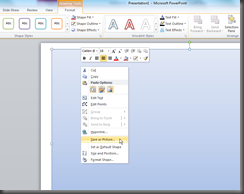
- Drag the shapes you want onto the slide, then right-click and select Save as Picture…
- Save the png to your desktop.
- Create a new Webi report, with the dimensions and measures that you want to display in your dashboard, and run the query. I'm going to assume you're reasonably familiar with the basic functions of Webi.
- In the properties for the page, deselect header and footer, make the page landscape and set all the margins to zero.
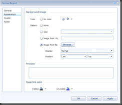
- With the page still selected, click the image icon in the toolbar (in XI3.1) or in BI4.0 right click the page and select Format Report… and go to the Appearance section.
- If you want the image to remain with the report when it's opened off-line in Webi Rich Client, then select Image From File and load the file from your desktop. If you'd rather keep the file on the server, then copy the file to the images directory of the server, then select Image from URL and type the name of the file.
- In BI4.0 that folder is C:\Program Files (x86)\SAP BusinessObjects\SAP BusinessObjects Enterprise XI 4.0\images
- In XI3.1 it's: C:\Program Files (x86)\Business Objects\BusinessObjects Enterprise 12.0\images
- Select a display type of Normal and Top Left. This way the image won't move if the user changes to quick display mode.
- Click OK.
- Unless you're a very lucky, you'll find that your image is not the right size. Just go back to PowerPoint and adjust, it might take a few attempts to get the size just right. Once you've got it right, keep the PowerPoint file for next time.
You should now have a blank Webi report with a nice looking background. Note that in XI3.1, since you can't have charts with transparent backgrounds, you will need solid colours in the areas where the charts will go. In BI4.0 you can remove the background for a chart so they can sit directly on a gradient, if that's what you're into. - Add the charts to the dashboard. I won't go into the basics of how to create and format charts here.
- If you want your users to be able to click on a chart element and have that filter other charts in the dashboard, you will want to set up the chart as an input control. In BI4.0, right click the chart and select Linking > Add Element Link…
In XI3.1, right click the chart and select Define as input control - Go through the steps in the input control wizard, selecting the other elements of the report that you would like to have filtered when a user clicks the chart. Don't select the box to filter the entire report. This would mean that if you clicked the Canada slice of the pie, even the pie chart itself would be filtered to only show Canada, which makes no sense.
If you are using BI4.0 and haven't used the new charts before, there really is a lot of new stuff to take in. Here's the short version: - Right click > Format Report will get you to the formatting window. The properties panel from XI3.1 is gone. There's an enormous amount of new options;make sure you check out all the lighting effects under Global > Palette and Style. Note that options appear and disappear depending on the selections in some drop-downs.
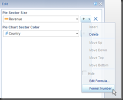
- Right click > Edit will get you the edit window for a chart, which is all about the data. This is where you come to change the dimensions/measures involved in the chart. And also where you set the number/date format.
- All of the sorting/filtering options are available in the right-click menu.
Xcelsius is still king of the dashboard world, but if you need something that can be published, taken offline, incorporate large chunks of raw data, and be edited by users, Webi is here for you.
Happy charting!
No comments:
Post a Comment