Webi as a What-if Scenario Dashboard
At some point or another, you’re bound to come across the requirement to allow a user to adjust some values shown in a report to see how they affect the bigger picture. For example, what if my sales quantities increased, but my buy price and employment expenses went up? In this post, I’ll create a Webi dashboard that allows a user to adjust the figures over a year and see the effect these changes have on a final result.
I’m Using
The Proper Way
If you’re looking for a robust and flexible budgeting and planning tool, you’ll want the wonderful SAP Planning and Consolidation (formerly BPC).
While I’m at it, I should give a shout out to Xcelsius (alright alright, ‘Dashboard Design’), which will do a mighty fine job of facilitating your what-if scenarios.
The End Result
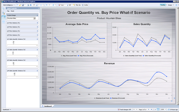
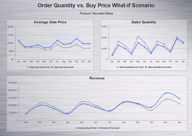
The grey lines in the charts are last year’s figures, and the blue lines are my forecast – the result of my what-if analysis. Down the left side of the screen are input controls that let me adjust the variance from last year.
I’ll be asking the question “how will my revenue be affected if I increase the price of a particular product, and suffer an initial reduction in sales volume?”
The Dashboard
For some tips on how to get a Web Intelligence report looking more like a traditional dashboard, check out my Webi as a Dashboard post.
My base data is last year’s sales split into average sale price by month, and sales volume by month. These values are represented in the top two charts. The chart at the bottom shows the resulting revenue, a simple multiplication of the two.
I want to be able to increase or decrease the average sale price and sales quantity by quarter. I could do this by month, however the more granular the control, the more input controls required. For each of the two metrics, I will create a variance variable. This will will define (in percentage points) how much to increase or decrease the value based on last year’s figures. In short, these are the three parts to this:
Let’s get started.
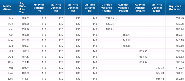
The first column is my month dimension. The second column shows last year’s sales volume. The remaining 9 columns are the variables that I’ve just created. See how each month is multiplied by the appropriate percentage and the results are shown in the final column.
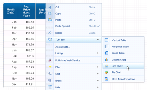
If you remove some columns so you’re left with only the first two and the last, then right click the block and Turn Into > Line Chart…
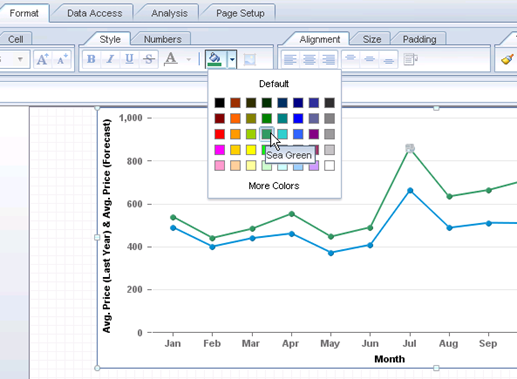
…you’ll get a chart that looks something like the below. The only formatting tip I’ll give here is that you can click on one of the points in a line, and use the bucket on the Format tab to set the color for that line.
Bonus tip: On the Format tab, in the Chart Style area, you can set the style to ‘flashy’, if you’re into that sort of thing.
Repeat all the steps above for any other dimensions you wish to control (for me this is sales quantity), and add a result chart (for me this is Revenue, which is simply Price x Quantity). Your end result may look a little something like this.
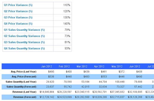
If required, you can show the individual values on page two of the report. This way the data can be easily be exported to Excel.
Note that you can’t do this on a separate tab of the report, since input controls only apply to the tab that they’re on.
We’re almost done, so I might as well take the chance to plug my book, right? Go on, check it out. I’m told it’s pretty great.
Moving on, you now have a dashboard that allows some basic manipulation; apply a little imagination and I’m sure you can create something pretty cool.
- See more at: http://blog.davidg.com.au/2012/09/webi-as-what-if-scenario-dashboard.html#sthash.QpRMPWZ3.dpufI’m Using
- BusinessObjects BI4.0 SP4 (XI3.1 SP3 or later will do)
- You’re familiar with BusinessObjects and Webi. A thorough understanding of Webi formulas will help.
- You have a data source already set up.
- You have the desire or requirement to alter values to create a what-if scenario.
The Proper Way
If you’re looking for a robust and flexible budgeting and planning tool, you’ll want the wonderful SAP Planning and Consolidation (formerly BPC).
While I’m at it, I should give a shout out to Xcelsius (alright alright, ‘Dashboard Design’), which will do a mighty fine job of facilitating your what-if scenarios.
The End Result

The grey lines in the charts are last year’s figures, and the blue lines are my forecast – the result of my what-if analysis. Down the left side of the screen are input controls that let me adjust the variance from last year.
I’ll be asking the question “how will my revenue be affected if I increase the price of a particular product, and suffer an initial reduction in sales volume?”
The Dashboard
For some tips on how to get a Web Intelligence report looking more like a traditional dashboard, check out my Webi as a Dashboard post.
My base data is last year’s sales split into average sale price by month, and sales volume by month. These values are represented in the top two charts. The chart at the bottom shows the resulting revenue, a simple multiplication of the two.
I want to be able to increase or decrease the average sale price and sales quantity by quarter. I could do this by month, however the more granular the control, the more input controls required. For each of the two metrics, I will create a variance variable. This will will define (in percentage points) how much to increase or decrease the value based on last year’s figures. In short, these are the three parts to this:
- Original data (based on last year)
- Variance (how much should I adjust it by)
- Result data (my forecast).
Let’s get started.
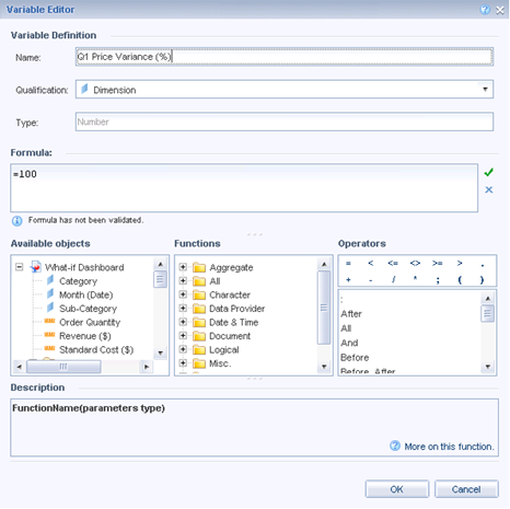
- Create a new dimension variable named Q1 Price Variance (%) and give it a value of 100. This will later be controlled by an input control. When the value is 100, there will be no difference between last year and the forecast. If, for example, the value was changed to 90, then the forecast value will be 90% of last year.
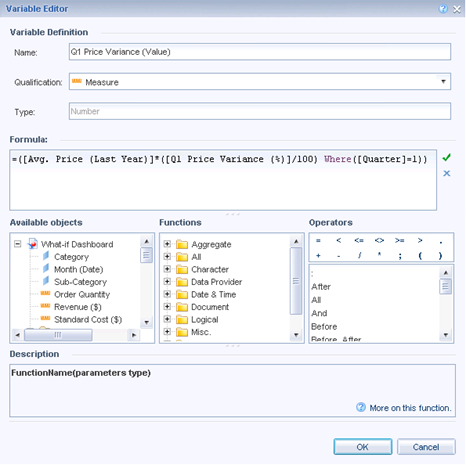
- Now create a measure variable named Q1 Price Variance (Value) and enter the formula below.
In plain English, the formula says: “take the average sales price from last year, and adjust it by x% for the first quarter of the year.” The where clause means this formula won’t return any data for months that aren’t in the first quarter. This will make more sense in a minute. - Repeat the steps above for the remaining three quarters.
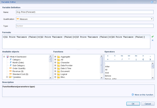
So now you have eight new variables. Four of them hold a value that defines how much to adjust the value by (defaulting to 100), and four that define the resulting value. If you add these four together, then you have a new measure the will show the adjusted version of the average price for last year. - So, create this final measure that simply adds the four quarters together. It should look like this:

The first column is my month dimension. The second column shows last year’s sales volume. The remaining 9 columns are the variables that I’ve just created. See how each month is multiplied by the appropriate percentage and the results are shown in the final column.
If you remove some columns so you’re left with only the first two and the last, then right click the block and Turn Into > Line Chart…

…you’ll get a chart that looks something like the below. The only formatting tip I’ll give here is that you can click on one of the points in a line, and use the bucket on the Format tab to set the color for that line.

Bonus tip: On the Format tab, in the Chart Style area, you can set the style to ‘flashy’, if you’re into that sort of thing.
Repeat all the steps above for any other dimensions you wish to control (for me this is sales quantity), and add a result chart (for me this is Revenue, which is simply Price x Quantity). Your end result may look a little something like this.

If required, you can show the individual values on page two of the report. This way the data can be easily be exported to Excel.

Note that you can’t do this on a separate tab of the report, since input controls only apply to the tab that they’re on.
We’re almost done, so I might as well take the chance to plug my book, right? Go on, check it out. I’m told it’s pretty great.
Moving on, you now have a dashboard that allows some basic manipulation; apply a little imagination and I’m sure you can create something pretty cool.
I am not clear with the solution, Is it possible for you to give more clear note. I need solutoin for what if Analysis..Thanks.
ReplyDelete