BI Services with Crosstabs (Variable Columns)
BI Services are great. But they have a few weak points, and the one area they lose out to Live Office is their handling of crosstab data. That is, you need to know how many columns your Webi block will have in advance before using that BI Service in Xcelsius. In this post, I’ll show you a trick to get around this limitation.
I’m Using
An Example

This is your data, and you want to get it into your amazing dashboard.
No problem, you make a BI Service of it and bind that to a range of cells in your Xcelsius model. Nice.
Then July rolls around and your seven by seven range is no longer good enough. Let's fix that.
Consuming the BI ServiceCreate your BI Service just as you would normally. The trick is in the consumption.
First let’s see how it looks when it works.
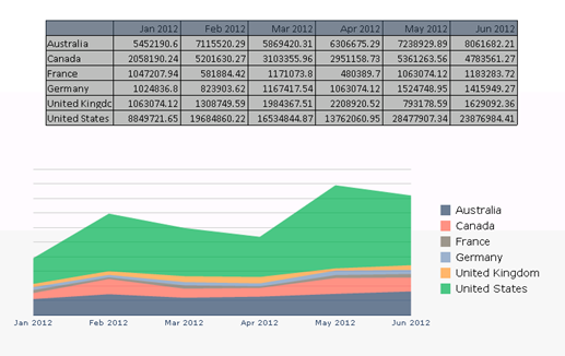
Here I have a spreadsheet component and an area chart feeding off the range from my BI Service. But what if the number of months in my source data changes, perhaps a new month arrives, or a user is allowed to filter on the horizontal dimension.
When this happens in the source data (seven months):

This happens in your dashboard:
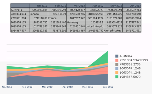
Uh oh.
Here’s what’s happening: the top row of the data is the header. This is a separate range so the extra column just gets chopped off. Starting from the next row down, it starts to print the Australia row. It prints the first six months without a problem. But where there’s no more space for the July cell, it loops around and prints it in the next row.
Which brings us to the main point to remember here: the data coming through from the BI Service has no concept of rows. It’s just getting one long string of cells. So the whole thing working relies on you knowing how many columns to expect and restricting the BI Service to bind to only that many columns in your spreadsheet.
Let's CoordinateSo what can you do? Bring the BI Service in as a single column, like so:

And write a formula to select the correct cell to populate your chart. Here’s how:
Lay of the LandThis is what the finished result looks like. Grey cells are connection data ranges (the BI Service will populate these directly). Orange cells are Excel formulas. Different shades of orange signify that adjacent cells have different formulas. I know I won’t have more than 12 months, or more than 10 rows, so this is what I’m allowing for. You may use more or less.
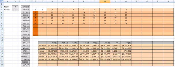
The top orange grid houses the row number of the piece of data that ‘belongs’ in this position. Remember that the aim is to re-create the original Webi block. The bottom orange block, with the actual data, uses the top orange grid to look up the values in the vertical data in the grey region.
Bonus Tip: If you’re wondering how I’m getting BI Service data into the model, click Preview, wait for the model to load, then click File > Snapshot > Current Excel Data. Save the Excel file, close the preview, then import the Excel file back into the model.
Four FormulasThere are four different formulas at work here.
The first formula simply returns a number to define which row of the block should be shown. It will only show as many rows as there are in the Webi block. The nbLines value is the number of rows of data. You’ll need to add 1 to take into account the header row (showing month names).

The second formula does the same thing for columns. Note that the BI Service reports how many columns there are in the horizontal axis of the crosstab. So I have to add 1 here to include the first column (that shows country name).

The body of the top orange range simply says add x to the number in the cell above me.

So, if there are 8 columns of data, + 1 column for the country names, there will be nine columns. The first cell in the next row with be the 10th value. Have a look in the grey column with the raw data. ‘Canada’ is the 10th cell down. Get it?
To stop the formula returning errors if there is no data, all of them are wrapped in IF statements that check that the cell is within the range of columns and rows in the original Webi block.
Formula number four is the contents of the bottom orange range, and it’s pretty simple.
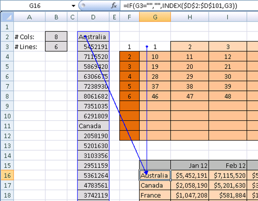
It says, take row number x from the raw data, using the INDEX function.
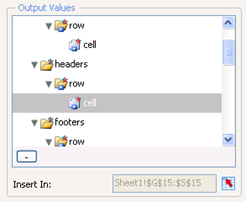
But what about the headers (Jan 2012, Feb 2012, etc.)? This is no different to how you would normally work. That is, the headers > row > cell property of the BI Service is bound directly to these cells.
The ChartPerhaps obviously, you then bind your chart as you normally would to this range of cells. Make sure to go to the Behaviors tab of the chart and tick Ignore Blank Cells for In Series and In Values.

That’s it!
- See more at: http://blog.davidg.com.au/2012/06/bi-services-with-crosstabs-variable.html#sthash.i6qkhRHZ.dpuf- BI4.0 FP3 Patch 3 (but this applies all the way back to XI3.1)
- Xcelsius 2011 FP3 Patch 3
- You know your way around Webi, Xcelsius and BI Services
An Example

This is your data, and you want to get it into your amazing dashboard.
No problem, you make a BI Service of it and bind that to a range of cells in your Xcelsius model. Nice.
Then July rolls around and your seven by seven range is no longer good enough. Let's fix that.
Consuming the BI ServiceCreate your BI Service just as you would normally. The trick is in the consumption.
First let’s see how it looks when it works.

Here I have a spreadsheet component and an area chart feeding off the range from my BI Service. But what if the number of months in my source data changes, perhaps a new month arrives, or a user is allowed to filter on the horizontal dimension.
When this happens in the source data (seven months):

This happens in your dashboard:

Uh oh.
Here’s what’s happening: the top row of the data is the header. This is a separate range so the extra column just gets chopped off. Starting from the next row down, it starts to print the Australia row. It prints the first six months without a problem. But where there’s no more space for the July cell, it loops around and prints it in the next row.
Which brings us to the main point to remember here: the data coming through from the BI Service has no concept of rows. It’s just getting one long string of cells. So the whole thing working relies on you knowing how many columns to expect and restricting the BI Service to bind to only that many columns in your spreadsheet.
Let's CoordinateSo what can you do? Bring the BI Service in as a single column, like so:

And write a formula to select the correct cell to populate your chart. Here’s how:
- In Xcelsius, go to your connection and set the Input Values property turnOutputToVTable to ‘TRUE’
- In Output Values, map the table > row > cell value to a vertical range of cells. If you’re expecting up to 10 rows and 10 columns, then map 100 rows (1 column wide).
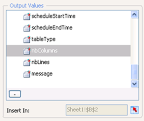
- Still in the Output Values box, map the nbColumns and nbLines values to cells in your spreadsheet.
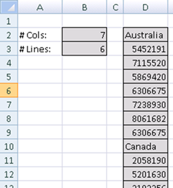
- So now all my data is coming into my spreadsheet like this:
Lay of the LandThis is what the finished result looks like. Grey cells are connection data ranges (the BI Service will populate these directly). Orange cells are Excel formulas. Different shades of orange signify that adjacent cells have different formulas. I know I won’t have more than 12 months, or more than 10 rows, so this is what I’m allowing for. You may use more or less.

The top orange grid houses the row number of the piece of data that ‘belongs’ in this position. Remember that the aim is to re-create the original Webi block. The bottom orange block, with the actual data, uses the top orange grid to look up the values in the vertical data in the grey region.
Bonus Tip: If you’re wondering how I’m getting BI Service data into the model, click Preview, wait for the model to load, then click File > Snapshot > Current Excel Data. Save the Excel file, close the preview, then import the Excel file back into the model.
Four FormulasThere are four different formulas at work here.
The first formula simply returns a number to define which row of the block should be shown. It will only show as many rows as there are in the Webi block. The nbLines value is the number of rows of data. You’ll need to add 1 to take into account the header row (showing month names).

The second formula does the same thing for columns. Note that the BI Service reports how many columns there are in the horizontal axis of the crosstab. So I have to add 1 here to include the first column (that shows country name).

The body of the top orange range simply says add x to the number in the cell above me.

So, if there are 8 columns of data, + 1 column for the country names, there will be nine columns. The first cell in the next row with be the 10th value. Have a look in the grey column with the raw data. ‘Canada’ is the 10th cell down. Get it?
To stop the formula returning errors if there is no data, all of them are wrapped in IF statements that check that the cell is within the range of columns and rows in the original Webi block.
Formula number four is the contents of the bottom orange range, and it’s pretty simple.

It says, take row number x from the raw data, using the INDEX function.
But what about the headers (Jan 2012, Feb 2012, etc.)? This is no different to how you would normally work. That is, the headers > row > cell property of the BI Service is bound directly to these cells.

The ChartPerhaps obviously, you then bind your chart as you normally would to this range of cells. Make sure to go to the Behaviors tab of the chart and tick Ignore Blank Cells for In Series and In Values.

That’s it!
Now BI Services and crosstabs can play nice, but keep a check on the load times if you start creating ranges with thousands of formulas. Dare I say it, don't listen to the internet about how many formulas you should have in your dashboard; use a stopwatch, run it on a typical machine, keep an eye on the RAM usage and decide for yourself.
Now, I've got a few Live Office connections to convert...

No comments:
Post a Comment