Sparkline Charts in Webi
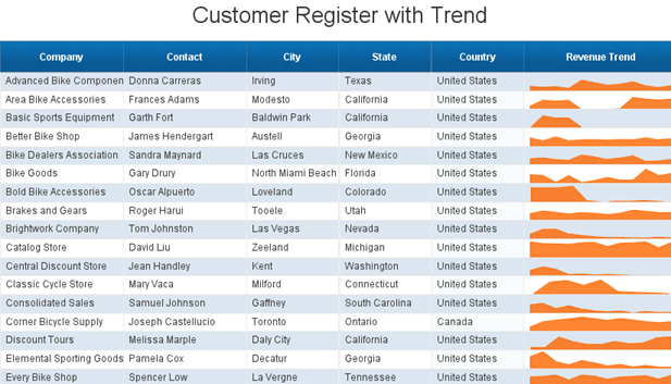
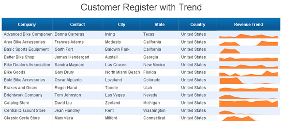
Sparklines. They’re a great way to show a lot of information in a small amount of space. We’ve had them in Xcelsius and the BI Mobile app for a while now, but they’re not yet officially available in Webi. This trick will show you how to grace your Webi report with a sparkline.
I’m Using
The End Result
The How To
This one is quite simple. All I’m doing is creating a section with a normal area chart, the trick here is really about sizing and aligning the objects, and creating some formatting to give the result a familiar look and feel of a table (aka a ‘block’).
Generally speaking, sparklines are good for showing trend data (e.g. revenue for the last 12 months) to supplement other information. The example I use in this post is a simple list of customers, showing basic information in tabular format, and a graphic depicting sales over the last 12 months. Here’s how:
- See more at: http://blog.davidg.com.au/2012/12/sparkline-charts-in-webi.html#sthash.jBLu4GpD.dpufI’m Using
- BI4.0 SP5
- You’re familiar with Webi
- You have some trend data that you want to display in a Webi table.

The How To
This one is quite simple. All I’m doing is creating a section with a normal area chart, the trick here is really about sizing and aligning the objects, and creating some formatting to give the result a familiar look and feel of a table (aka a ‘block’).
Generally speaking, sparklines are good for showing trend data (e.g. revenue for the last 12 months) to supplement other information. The example I use in this post is a simple list of customers, showing basic information in tabular format, and a graphic depicting sales over the last 12 months. Here’s how:
- To understand what data you would like to show, imagine that you only want to show one column for revenue. Create the table as you normally would, including any formatting that you’d like to apply, like so.
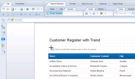
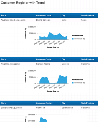
I’ve said it before, but if you’re getting started with BusinessObjects and need some practice data, I highly recommend Microsoft’s AdventureWorks database. - Create a section on whatever should signify a new row in your table. For me, this is simply customer name. Insert the new section above the table and ensure that your table is broken apart so that each section contains only one row.
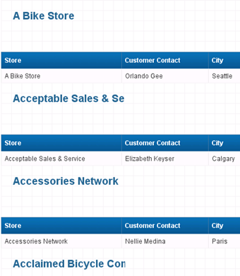
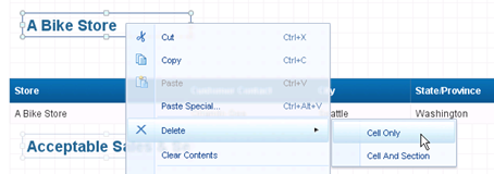
You should see something messy like the below. - Delete the large header that was inserted for each company (but don’t delete the whole section).
- In the body of the section, add the type of chart you want to see in your sparkline chart. For me, this is an area chart showing revenue by quarter.
Working with sections can be tricky; if you get lost, remember that you can view Structure Only which often gives better visibility of what’s being show on the page. - Right click the chart and select Format Chart…
- In the Global > Area Display section, untick the six tick boxes for Category Axis, Value Axis and Legend then click OK. You should now have a chart without the trimmings.
- Right click the edge of the table and select Edit Table…
- Under General, un-tick Show table headers.
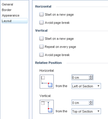
- Under Layout set the alignment to 0 from the left and top of the section.
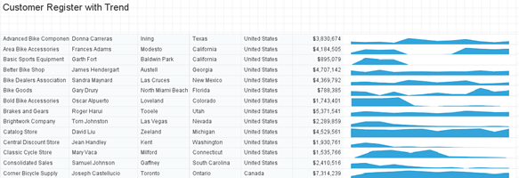
So now you have the all the components and the body of the table, all you need to do is align them. - You can click and drag if you like (snap to grid is your friend) but for setting column widths, it will help to use the properties dialogue for each object. Below is the result of setting column widths to nice round numbers (for me, 3cm, 4cm etc.) the cell height to 0.6cm, the chart and section height to 0.6cm and the section padding to 0.
- Add a blank cell for each of the columns that will act as the header. Set each one to the same width as the column below it, and also set them to Repeat on every page.
- Lastly, you can add conditional formatting using RunningCount to stripe the rows, if that’s your thing.


HANDY AS A POCKET ON A SHIRT ... NICE WORK
ReplyDelete